Auto Know.
An all-in-one car companion for people who know little to nothing about cars.
Role: UX/UI Designer · Tools: Figma · Timeline: 3 weeks · Solo project
The Problem.
Most car owners know how to drive, but not what to do when something goes wrong. Existing tools like CarFax and YourMechanic, each solves one piece of the puzzle, but none guides a complete beginner through the full experience.
Problem statement: Car owners with limited automotive knowledge need a way to understand, address, and act on vehicle issues confidently, without prior expertise or fear of being taken advantage of.
Design Goals.
With my research in mind, I focused the design around four clear goals, each tied directly to a user need:
Make diagnosis approachable
Build trust in buying/selling
Teach, don’t overwhelm
Connect users to trustworthy help
Research & Discovery.
I began with an audit of existing automotive apps and secondary research into common
pain points car owners face. Key insights that shaped the design:
Fear of exploitation
Fragmented tools
Age and digital literacy range
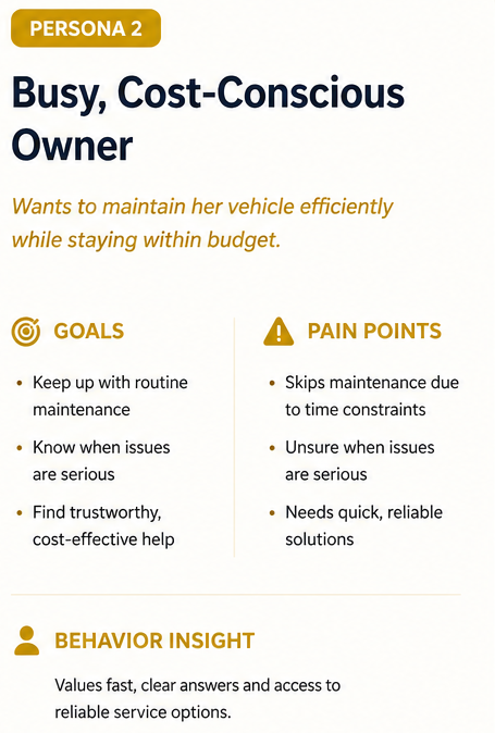
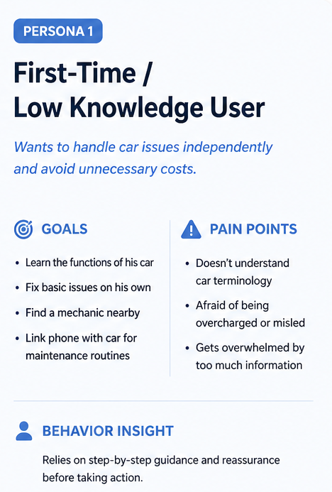
Defines target users to ensure experiences remain accessible, intuitive, and confidence-building.
Ideation & Design Process.
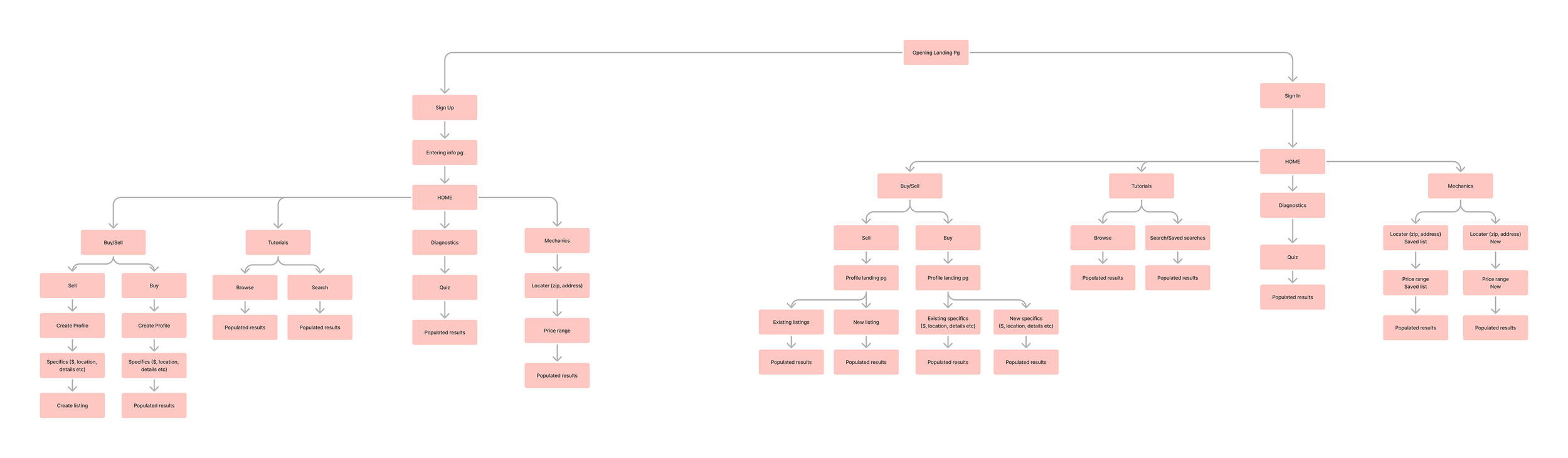
Maps how users move from identifying a car issue to diagnosing and taking action, ensuring a clear, guided experience across scenarios.

Translates structure into simplified layouts, prioritizing clarity, hierarchy, and step-by-step guidance over visual design.
Final Experience.
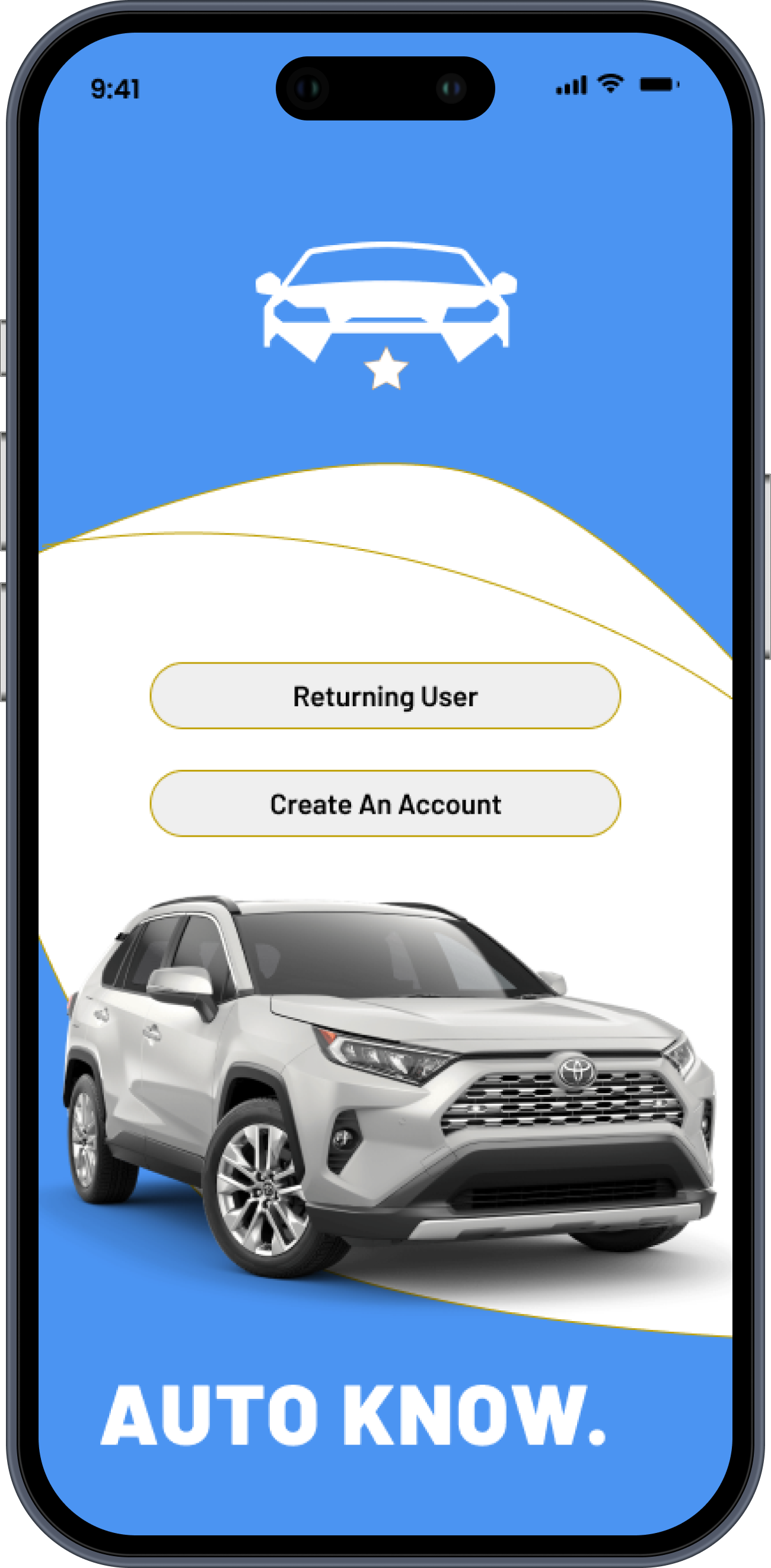
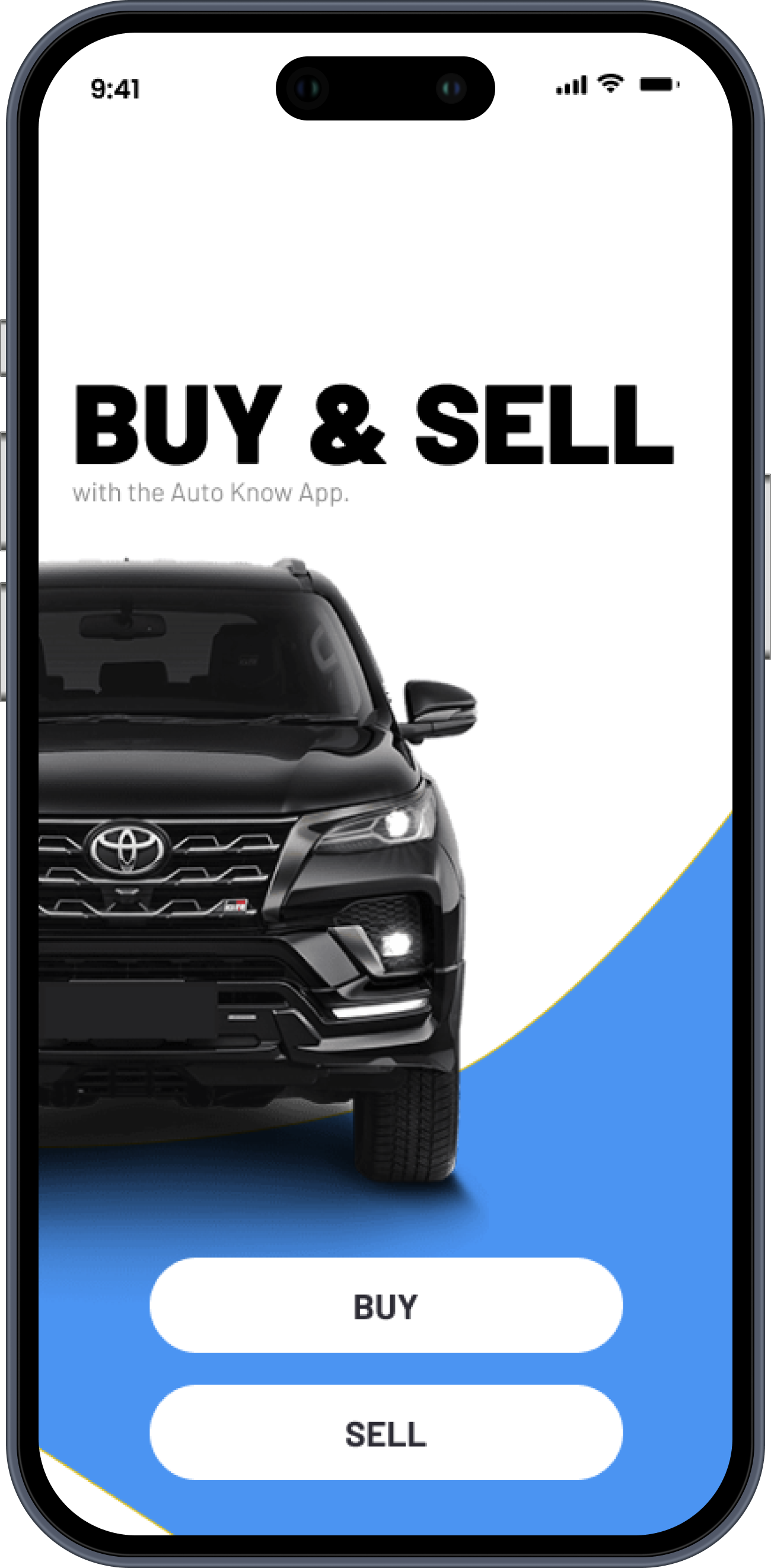
Onboarding/Landing:
icon-forward navigation lets users identify what they need instantly, no instructions required.
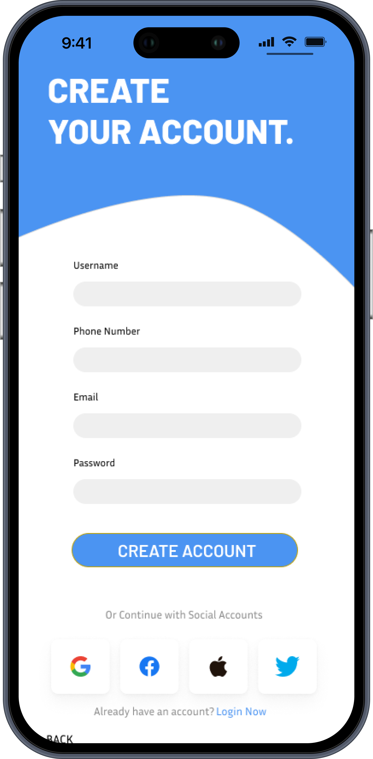
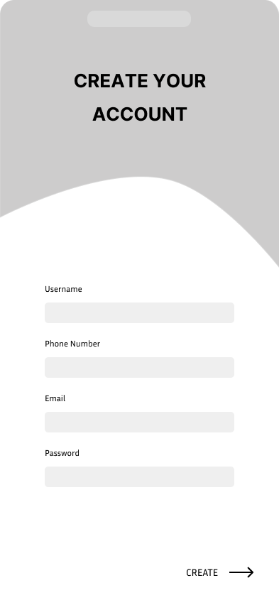
Account creation: captures vehicle info upfront, so the experience is personalized from the very first session.
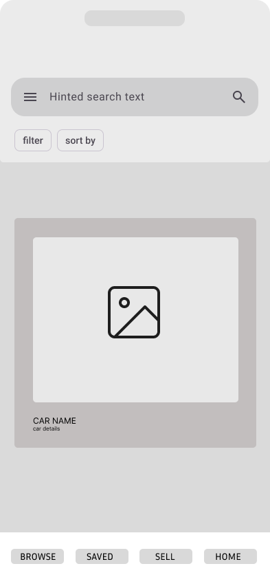
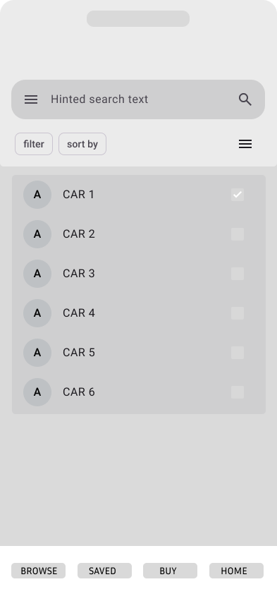
Buy & sell: surfaces pricing, condition, and history upfront so buyers feel informed before ever contacting a seller.
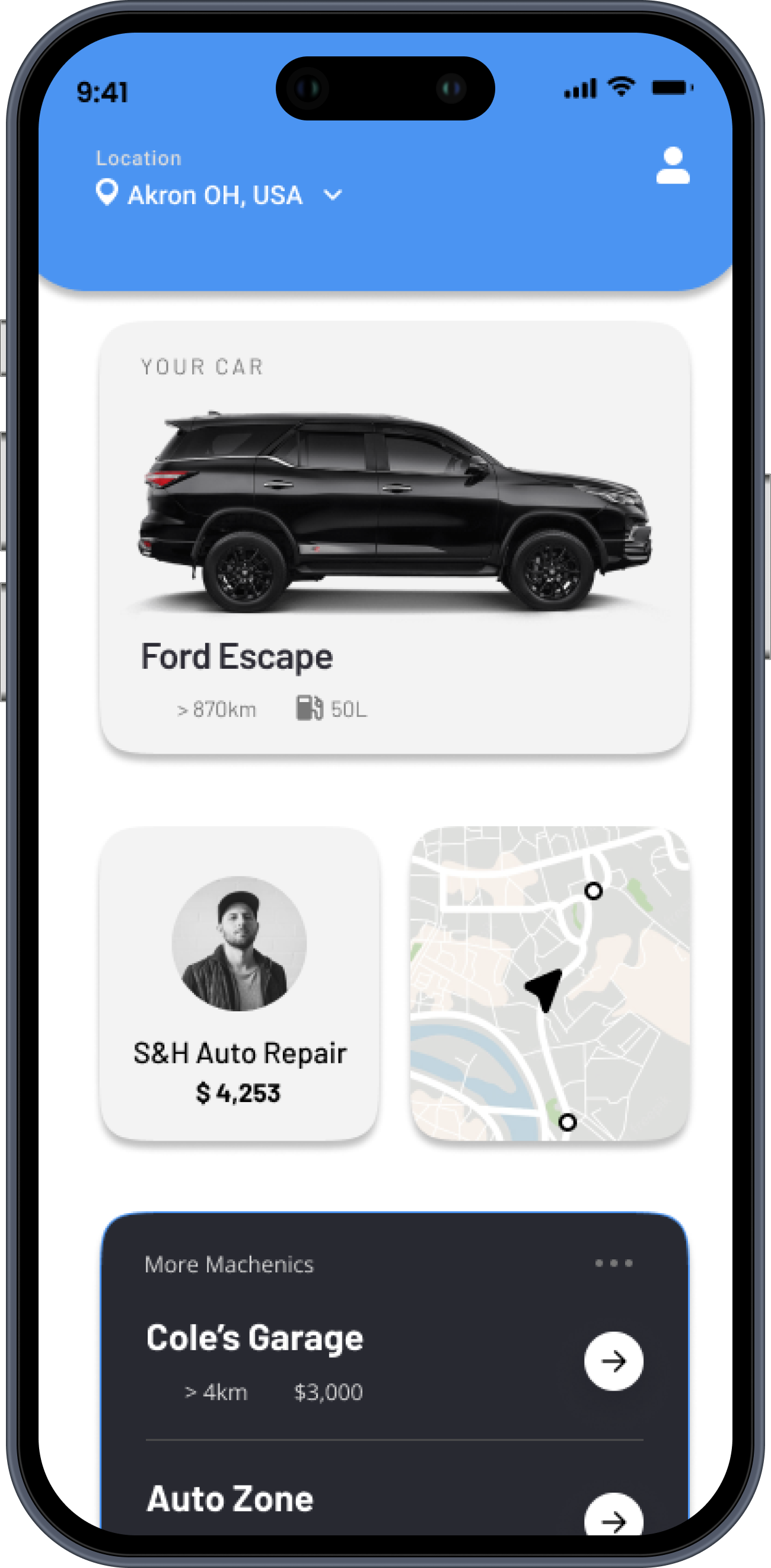
Find a mechanic: Cost estimates and reviews help users evaluate options before committing to a repair.
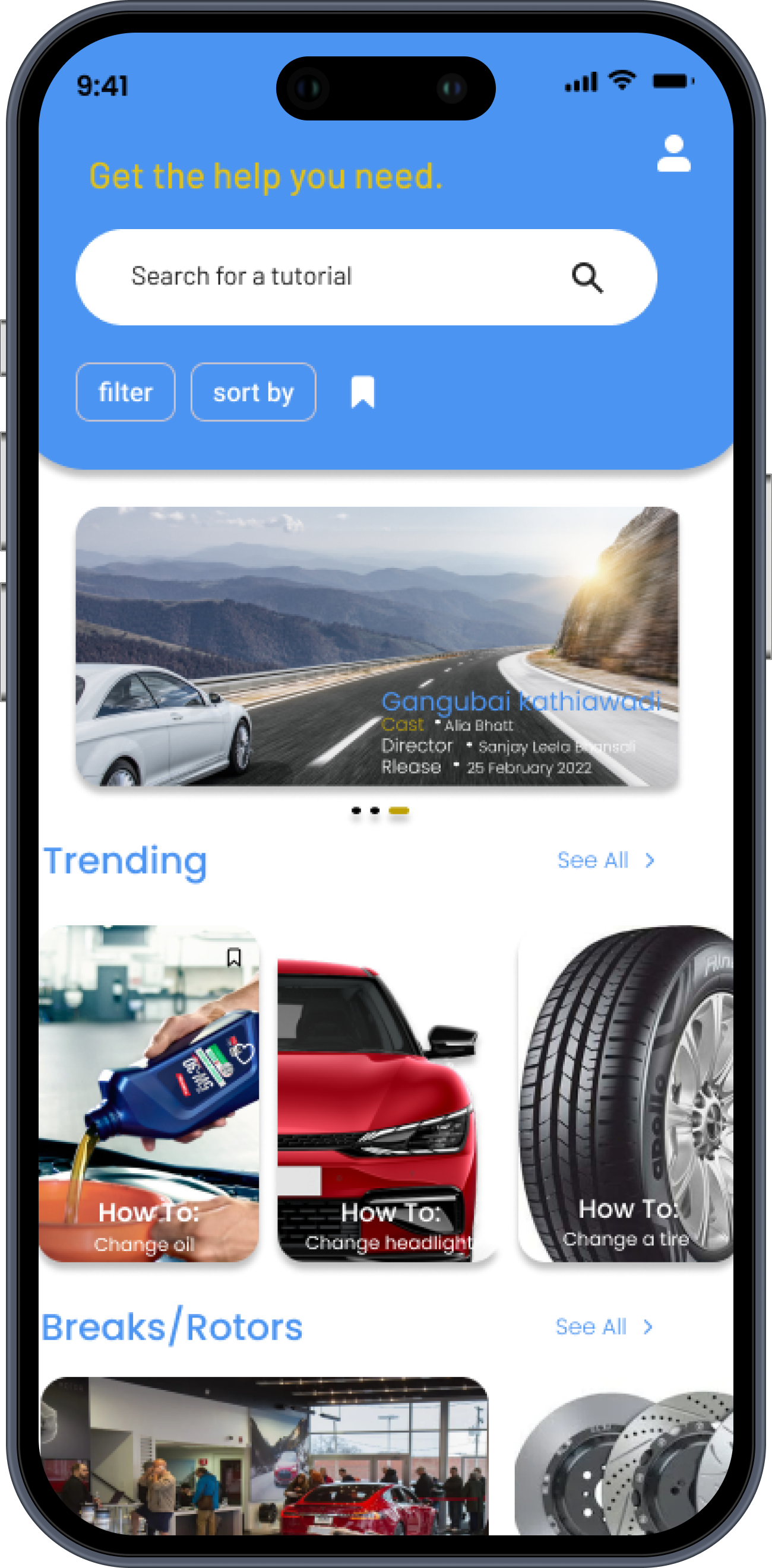
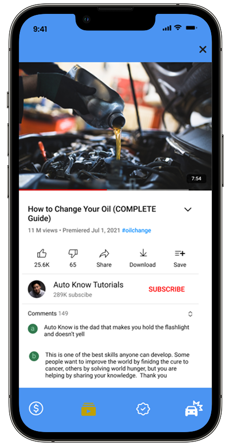
Find a tutorial & tutorial videos: videos are sourced and linked via an already familiar interface, YoutTube.
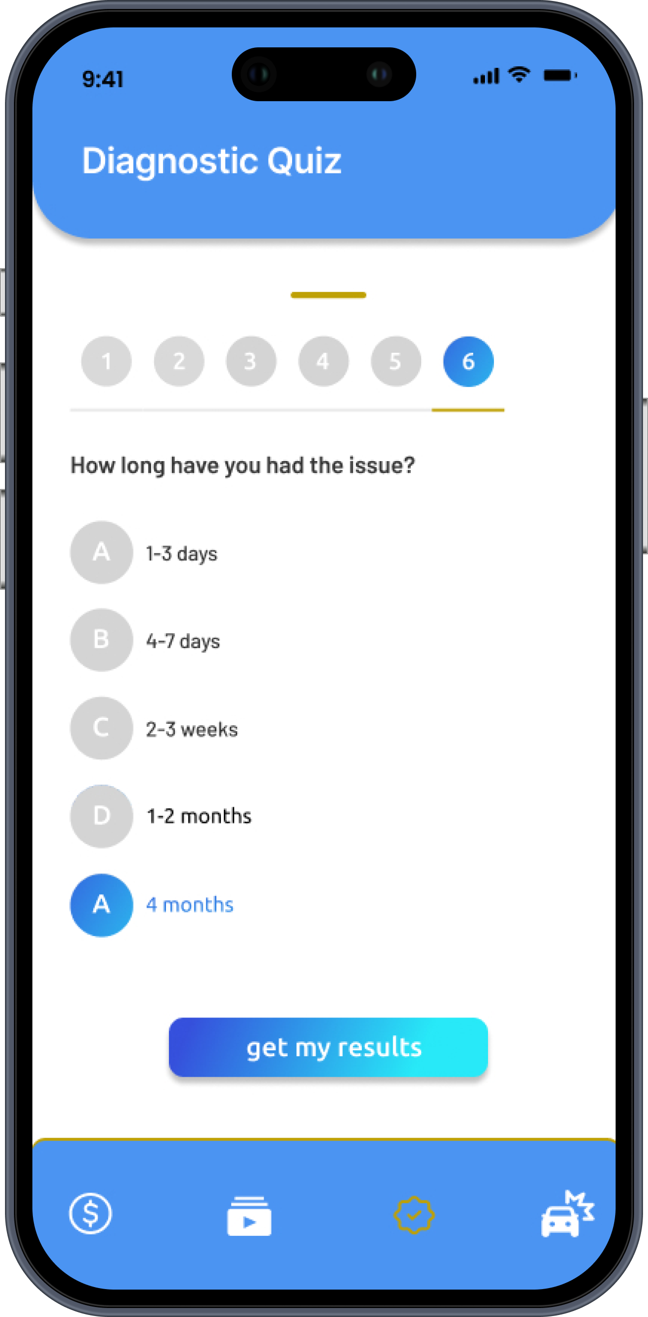
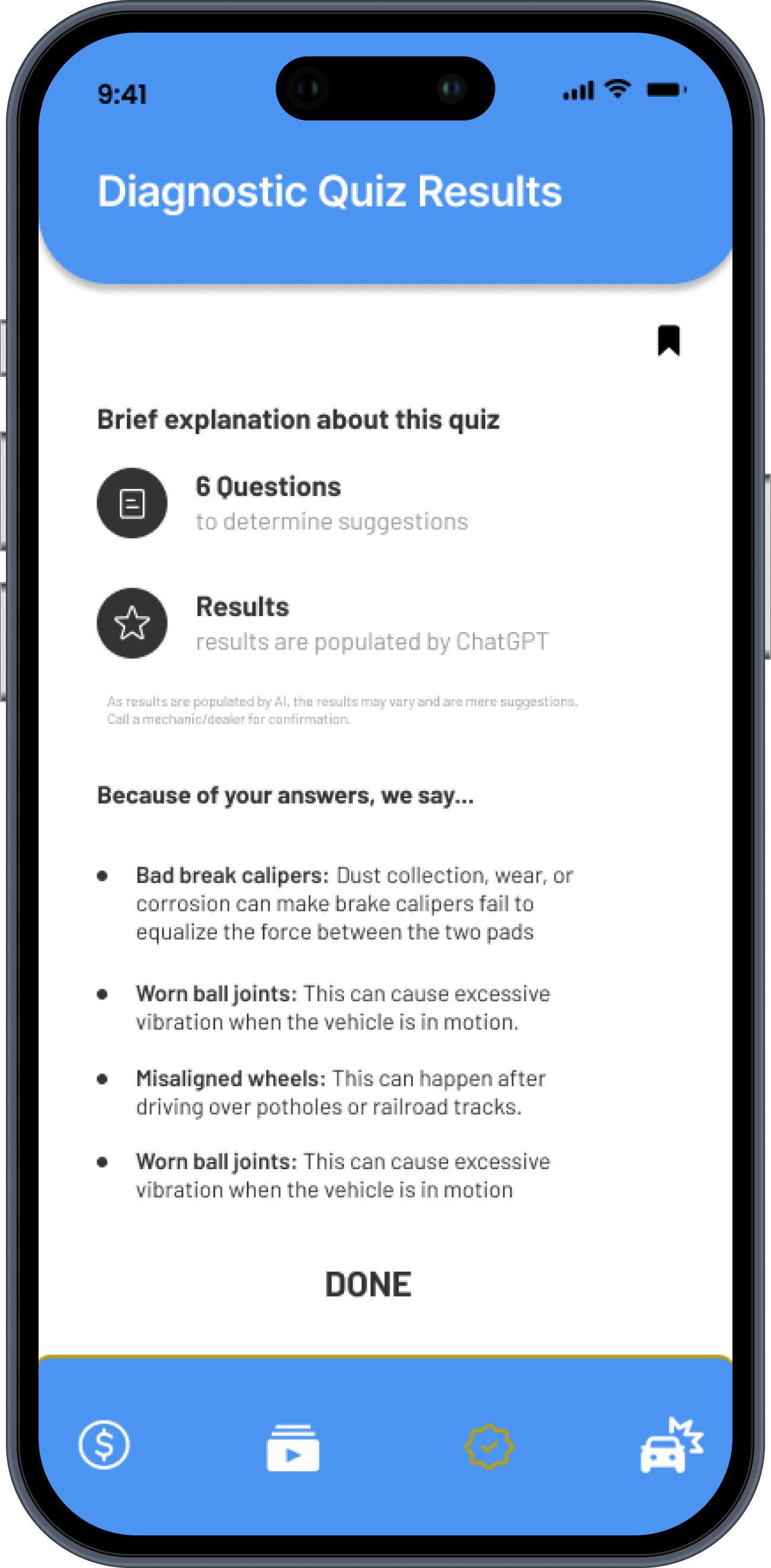
Diagnostic quiz: plain-language symptom quiz designed for roadside use, no mechanical knowledge needed.
Reflection & Next Steps.
This project was completed as a class assignment, but the problem it addresses is real. Automotive anxiety affects a wide range of people,
and most existing solutions assume a baseline of knowledge that many users simply don't have.
What I'd do differently with more time: I would conduct usability testing with users across different age groups and car knowledge levels, particularly to validate whether the diagnostic flow is genuinely usable in a stressful roadside situation. I'd also explore whether a chatbot, in addition to the AI-assisted diagnostic, could reduce the number of steps a user needs to take when something goes wrong unexpectedly.
What I learned: Designing for users with low domain knowledge requires constant restraint; every label, every flow, every piece
of copy has to earn its place. This project pushed me to think about clarity as a design principle, not just an aesthetic choice.